8 Tips to increase the conversion of your landings pages

The objective of most marketing actions is the user's action, and our efforts must be focused on moving the user to carry out this action, whether it is a purchase, registration to a database, participation in a promotion or sweepstakes... For this, the elements with which the user interacts must be conversion-oriented, i.e., the elements with which the user interacts must be oriented towards conversion, making the path to the desired action as easy as possible. Here are some tips to make your landings pages convert more:
1. Visible, simple, reliable form

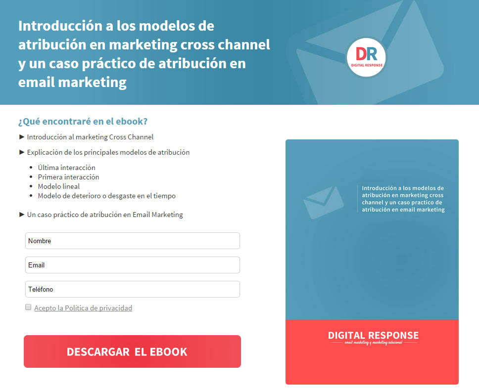
The form should be simple, with simple instructions on requested data and formats, reliable (with accessible and clear legal conditions) and visible. It seems obvious, but often, in favour of certain design criteria, the form is relegated to the background, leaving the protagonism to the image or to certain content. Sometimes it can be positive to drive the user's action, but it is something that should be checked, since in general, to increase the number of registrations, the form should be visible when entering the landing page, without the need to scroll.
To find out more about how to optimise the registration form you can read this post.
Outstanding benefit
What does the user achieve by carrying out the action? We must highlight and emphasise the value of the benefit. Make the user want to register, buy, participate... The benefit must be clear through the images and texts of the landing page.
3. Synthesises
Compress the message and convey it as clearly as possible through the copy and images of the landing page. Avoid anything that does not add value, simplify and do not add "filler" elements. Make the texts simple and clear, the images relevant and coherent with the message.
4. Responsive
More than half of users open email on mobile devices, we already know the importance of spending time viewing our email in these environments, but it would not make sense if the user clicks on the message and the landing page does not adapt to their device, as we would spoil the user experience.
5. Usability
Is the path to action as easy as it could be? Is there anything that could improve it in terms of user interaction? When carrying out the action, do we encounter any obstacles? Buttons that don't work the first time, long loading times, lack of confirmation page, lack of information formatting indications, ambiguity of the requested information... Let's detect any detail that may interfere with the process and correct it.
6.Generates a sense of urgency
"Give the user one or more reasons to take the action NOW, as "procrastination" means in most cases the user will abandon the process.
7. Test

In the same way that we test the performance of different elements in an email, we can and should test the performance of landing pages. Sometimes slight variations in copy, colours, typography or positioning of elements can have a significant impact on results. Testing can also help us to choose between more image/text based, long and information developed/brief and concise pages, etc.
8. Consistency with email
The content of the landing page must be consistent with the content of the email in several aspects: adapted to mobile, coherent with the branding and visual style (images, fonts, colours...) and with the tone of the message (corporate, colloquial, fun...),... A consistent image and message smoothes the process and improves the user experience. The consistency of the CTA is also very important. If our CTA varies from the email to the landing page, or even appears several times in a different way within the same landing page, it can lead to confusion for the user and generate friction in the process.
These are just some basic ideas for optimising the conversion of our landing pages, but there are certainly many more tips, based on your experience, with which you can complete this article. What tips would you add to this list?