The secret behind our responsive email templates
One of the main services demanded by our customers today is the responsive layout of your emails. As we never tire of repeating, 2015 was the year in which the responsive design The mobile phone has made a strong entry into the email marketing sector and today, it is something that cannot be ignored for the success of any email campaign. Without resorting again to market research and analysis that shows the overwhelming penetration of mobile usage, it is no longer lost on anyone to realise that mobile is the most popular form of email marketing. need to adapt any digital communication to mobile devices.
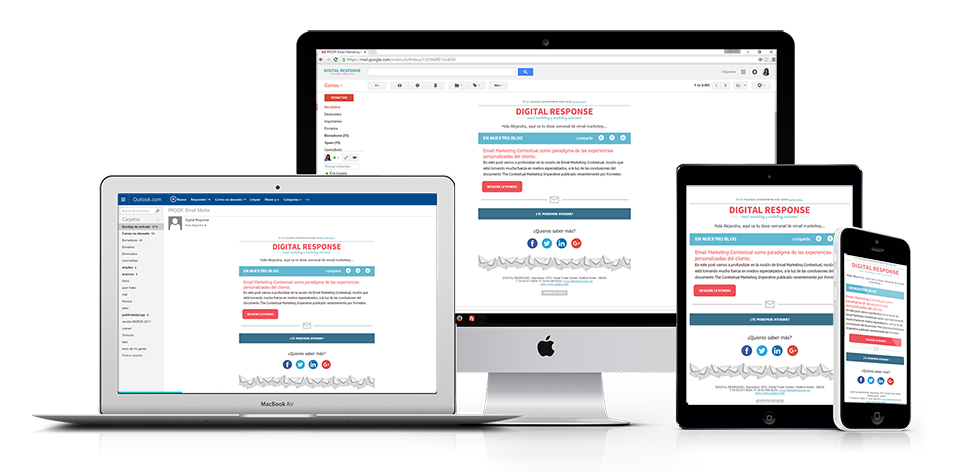
That's why the first thing customers ask for when they walk through our door is the mobile adaptation of your commercial emails and newsletters. This adaptation is not always easy, because of the limitations of this channel and to the difficulty of reaching the meeting points between design imperatives and responsive email layout needs. The most common problems we usually encounter when creating templates are texts that have to be kept as images for branding needs or overlapping images that cannot be rearranged in the mobile version. We also have to constantly adapt to the changes that different email clients make to the way they render some HTML/CSS elements. When we are the ones who apply the look & feel of the brand to the emails, the difficulties are reduced, given that we already plan the design taking into account all the limitations of the following layout phase, but in many cases when working with large brands, we find that they have their own design team that plans the visual part.
However, in spite of all the obstacles, and thanks to several experiences with clients with different needs, we have arrived at a working system that allows us to respond in a simple way to their requirements, obtaining flexible, customisable email templates to the different devices and favouring the subsequent "in-house" adaptation of each client. Here we tell you the secret and why more and more customers rely on our responsive email templates.
1. Prior training of the client and his design team on the limitations of email.
Whether the client does the design in-house or we do it for them, we train them in advance on the specific limitations of the email marketing sector so that they can understand the specific needs of the layout. When the design is provided by the client, this training is more exhaustive, given that designers, normally used to the requirements of the web, are not usually aware of the problems we face in order to correctly display a design in the different email clients.
2. Fluid dialogue between the design team and Digital Response's layout designers.
In order to build a consistent and flexible template, it is essential to maintain fluid communication with the design team. The main reason for this is that, as we mentioned in the previous point, the possibilities of web design are not comparable to those of email. It is well known the lack of understanding between the limitless imagination of designers and the technical requirements of web programmers, well, in the case of email the requirements and limitations are multiplied exponentially, so we seek not to limit, but to direct this creativity according to the needs of the email and find the best solution for the email. meeting point between creativity and functionality of the design. It is also important at this stage to define correctly and exhaustively the structural needs, in order to define the modules to be designed.
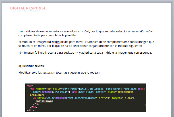
3. Modular layout.
Herein lies the versatility of the templates and the real secret of their reliability. The responsive layout of emails is very delicate, and the subsequent editing by the client is particularly dangerous. It is not enough to have knowledge of HTML/CSS layout, as the templates are often full of "hacks" that are difficult to understand for someone who doesn't do email layout. Tags and classes must be kept intact for proper functioning. It may seem that this conflicts with the flexibility and versatility of the templates, but to avoid this, we break down the designs to their most basic elements and create interchangeable modules according to the needs of each specific email. So, for example, we manufacture modules such as the following:
- Full width image
- Full width text
- 2 Columns on desktop - 1 column on mobile
- 4 columns on desktop - 1 on mobile
- 3 columns on desktop - 1 on mobile
- Desktop menu (hidden on mobile)
- Mobile menu (hidden on desktop)
- Etc.
We will apply the look and feel and graphic standards specified by the client to all of them.
4. Visualisation tests.
Before any delivery to the client, we carry out visualisation tests with Litmus and also with physical devices and different desktop and mobile applications. Once checked internally, we send tests to the client, in case they have different applications or software versions and are able to detect bugs that we have not identified in the first phase. After a phase of corrections and retesting we arrive at the final version of the template.
5. Delivery of responsive template + instructions for its adaptation.
Once the template has been configured and tested we add identifiers to the modules within the CSS template and use these identifiers in the instructions document. We try to make it as comprehensive as possible, without assuming prior knowledge on the part of the template editor. A kind of "Responsive Email for dullards"access by anyone who needs to edit the code, since in any case we do not recommend editing the template using WYSIWYG editors.which in most cases add or remove elements from the code and end up breaking the template.
6. Tracking the customer experience
Once the template has been delivered, we don't finish the work, but we make sure that the use of the templates is easy and we offer our support for any doubts or problems that they may encounter. The work is finished when the client handles the template fluently and begins to perform their work. responsive email campaigns fully autonomously.
Do you need a responsive template for your emails? Contact us 😉