What is the optimal width for my emails

We have already mentioned on other occasions that the email marketing industry is on the defensiveIn the case of the new technologies, it is difficult to introduce innovations due to the design limitations imposed by the different email clients. It is difficult to understand why there is no standard to support common design solutions. This is the main reason why responsive design has taken so long to settle in our emails, and even why, despite the advances in web design, email developers continue to use tables as a layout.
A basic issue we deal with on a day-to-day basis in the design and layout of emails is the width we should give to our messages. The usual standard is around 600-650px, as some email clients generate an uncomfortable side scroll when the width exceeds this figure. However, screen resolutions have continued to grow but the width at which we design messages has not. Why is this so?
1) UsabilityThe user is used to this standard width and interacts comfortably with the distribution of elements in this space. If we increase the width, will it be a surprise for the user, will it be more or less effective?
2) There are still tools and resolutions which can generate side scroll. In many email clients we do not have the full screen resolution to view it, but we have sidebars with menus or advertising that reduce the available space. Here is, for example, how I see the Yahoo and Outlook.com inbox from my 20" desktop monitor and my 15" laptop:
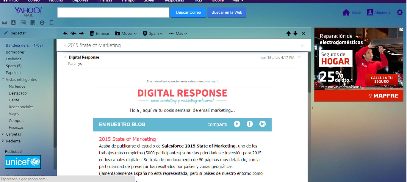
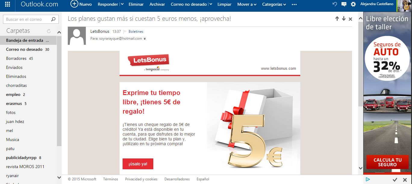
We can understand that on smaller laptops and other older monitors the space available to enlarge messages disappears. There are fewer and fewer cases where this happens, and this leads us to consider the option of designing for the most optimistic cases where we have white space on the sides of the email and we can better impact the user by taking advantage of this space.
We recently asked Litmus Community about this issue and got different views from various developers. Here you can see the discussion thread.
Some noted that a larger width increases the weight of the images that we use and with it the loading time of our emails (and let's not forget what a second means in email marketing and the difference it can make). However, we are already doubling the weight of images many times over for correct rendering at the resolutions. RetinaThis should not be a major problem.
On the other hand, there is talk of the easy responsive adaptation of these measures of 600-650px to mobile devices, and that a larger width would complicate the structure and adaptation of our emails. Finally, another reason given is that users often view their emails in small windows that do not occupy the entire screen and this leaves out part of the content in case of designing for larger widths.
For our part, we at Digital Response are testing other options to come up with an elaborated list of pros and cons. We will share it as soon as we have the conclusions. In the meantime, we would like to encourage this debate and get the views of other professionals, what do you think? Have you implemented wider widths to adapt to the new resolutions, and what is it that keeps us sticking to these standard sizes?