The best examples of email marketing campaigns 2016

Nowadays it is not uncommon to find people with more than one email account; you yourself probably have at least two accounts (even if one is for work). Over the years you've sent and received a lot of emails, and some of them have had questionable subject lines with a form similar to this one, going straight to the spam folder.
Many advertisers have failed to adapt advertising to a medium as personal as email. For email marketing to work, a marketing team must first have the ability for the subscriber to have a secondary email account, which they never look at, and to which they redirect all mail they do not want to receive. On that basis, what can the marketer do to get their email into the inbox of the primary email - the important one?
We have compiled a list of some of the best email marketing campaigns to inspire those marketing teams who are still lost amidst dismal campaign response statistics.
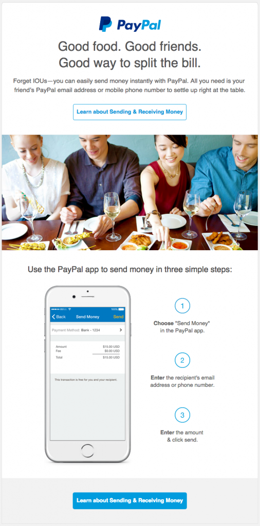
1) PayPal
"Good food. Good friends. A good way to split the bill", that's the main slogan launched by PayPal in this email, which we think is a great idea. Think about it: how many times have you found yourself in the situation of going out to eat with friends and things get tense when it's time to pay the bill? Using this messageBy being close to everyday situations, and at the same time giving a clear answer to a problem, PayPal wins the interest of its audience.
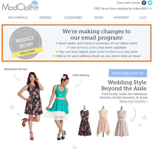
 2) ModCloth
One of the things that irritates users the most is receiving an email they do not want to receive and not knowing where the unsubscribe information is. This opacity on the part of companies, who believe that this way they retain more customers, is actually a very easy way to generate "hate" towards the brand, which appears insecure and disrespectful of the user's rights.
This is why we liked ModCloth's campaign in which they informed, in a very friendly and colloquial way, about the changes in their subscription policy and the changes in their email campaigns; specifying things like how many emails were going to be sent, and including a link to the subscription preferences in case any user wanted to change theirs. In reality, the more transparency, the better. The user counts on the fact that they can opt out of the emails at any time, but first they decide to "try it out" to see how it goes, to make sure if the information they will receive is of interest to them or not. At the end of the day, keeping them on the subscriber list out of obligation does not do the company any favours; they are not potential customers, nor will they like the brand after the experience with the email campaign.
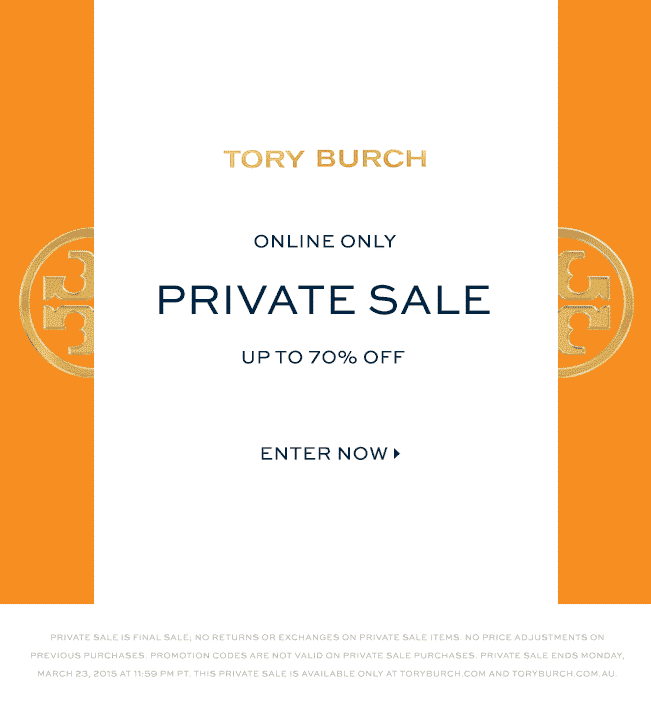
 3) Tory Burch
This clothing brand makes a commitment to originality and exclusivity that we think works very well. The image opens slowly, as if it were the doors of a palace, to give way to a message that makes you feel special: "private discounts up to 70%". The message you send with an email like this is that the user is special and that thanks to their email subscription they have access to discounts that no one else can access. Therefore, you give them a reason to stay subscribed.
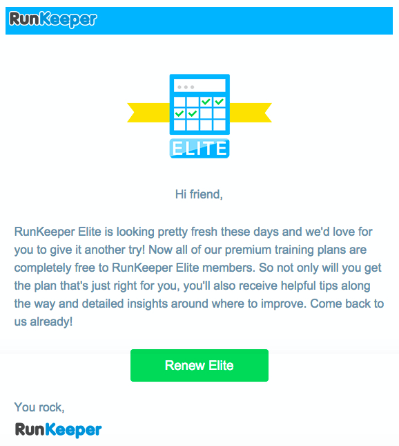
4) RunKeeper
RunKeeper's strategy is a very generous gamble. Their campaign to win back lost customers, or those who have lost interest in the app, consists of sending them an email reminding them of the new advantages of the app, as well as offering them free access to all premium plans. How can you refuse something for free?
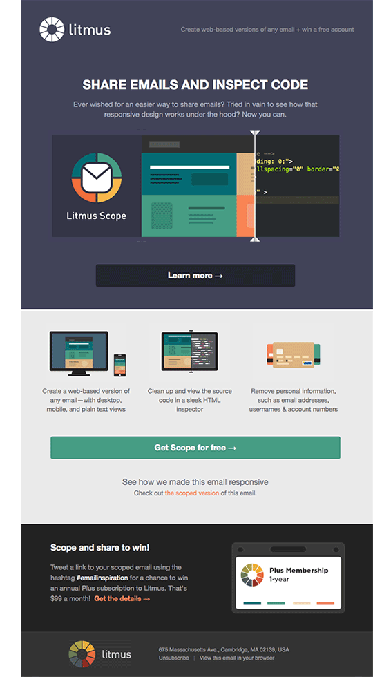
5)Litmus
Another good example of interaction in an email is the Litmus campaign; the animation they use serves to create a more interesting design that engages the user. Unlike static text, the movements have the ability to ignite a spark in the reader that will lead them to "look under the bonnet" and dive deeper into the rest of the content. In addition, the header does a very good job of introducing the theme of the message: "Share emails and inspect the code", explaining in the subtitle the functionality of this tool that allows to know the code of any email; a message that is very well accompanied by the animation, which helps to internalise the information and see it more clearly.
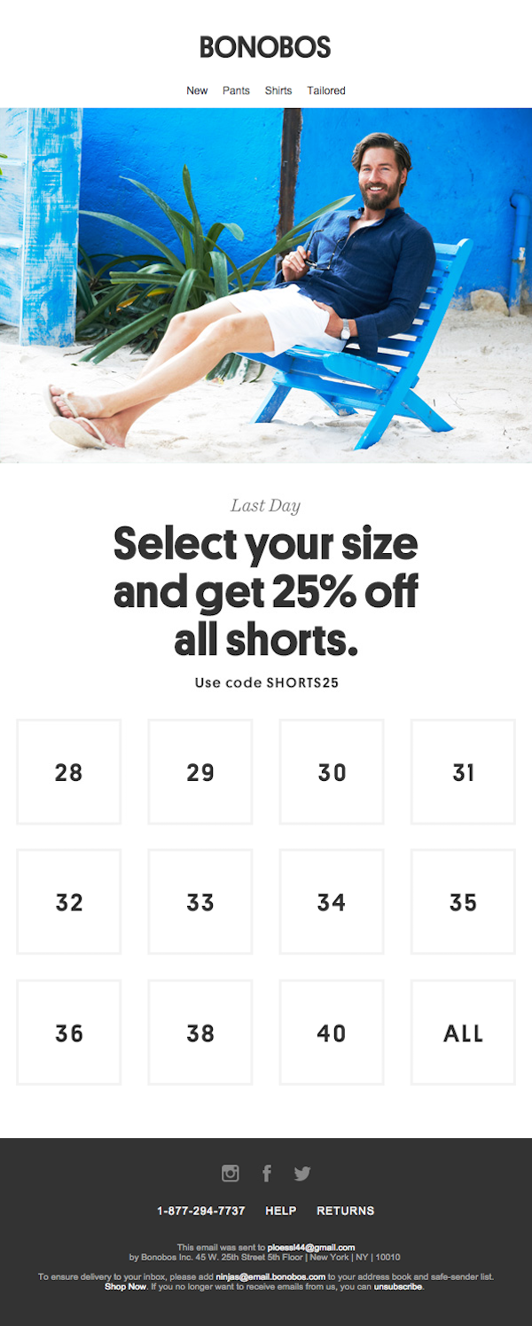
6)Bonobos
If you want to create engagement with your emails, give users a reason to do so. The Bonobos example is simple, clear, minimalistic; a very basic campaign but ingenious at the same time. They play with an interactive experience that encourages the recipient to take an action and, therefore, does not leave them passive to the email. The structure of the design is intended for those who have no time to waste in navigating through the email to find what they want.
7) J. Crew Factory
For many, the moment of wrapping a gift is an "oh oh" moment. J. Crew Factory takes advantage of this curious lack of society, very widespread and common, to offer a solution. Don't want to wrap the gift? Then give something that doesn't need to be wrapped, like a gift card.
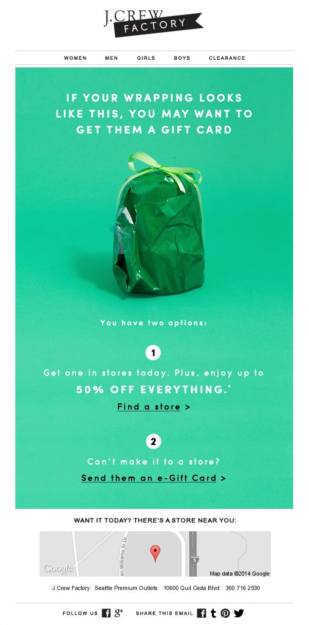
The structure of the email is very simple and clear; something that by now you will have guessed is a safe bet for an email marketing campaign. There are 2 ways to get the gift card, so that no one will miss out on one if they want it, and even a map of the nearest location is included. The aim of this design is to make use of the technique "the fewer barriers to purchase, the better". You make everything very easy for the buyer; explaining everything quickly and in simple steps.
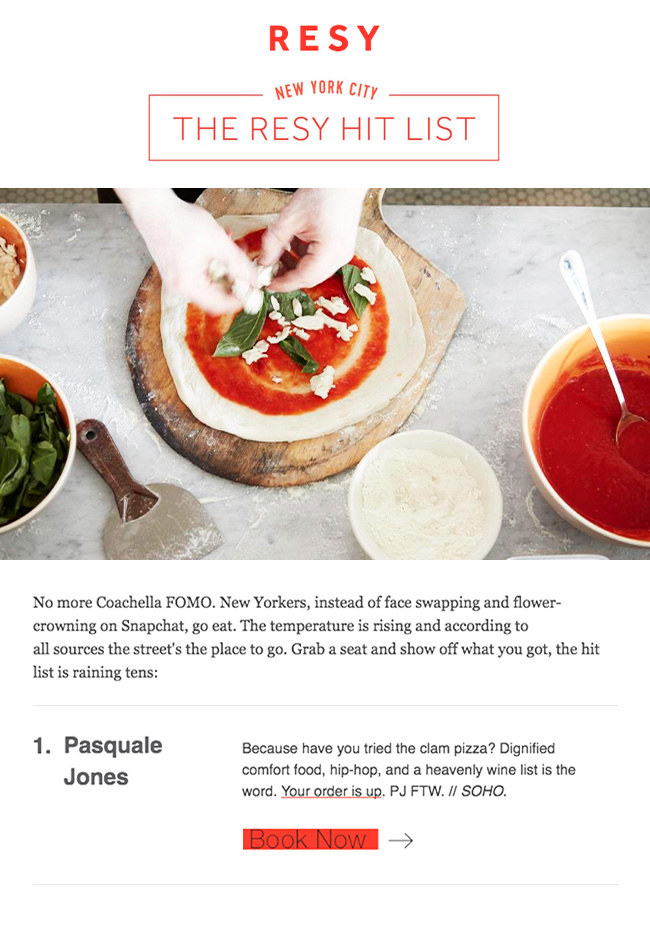
8)Resy
Resy is a New York restaurant chain that uses a very particular style for such a business. Their email campaign looks more like a food blog; it features a large, eye-catching and appetising photograph, why not admit it, accompanied by a food magazine-style text that, at the same time, encourages the user to go for a drink at their restaurant and make a reservation. This style gets the reader into a more receptive frame of mind; they don't feel directly 'commanded' to make a reservation; they first get into the mood with a picture of food, then read a nice text and finally think: "I can go and try here".
There are many possibilities for turn advertising emails into an experience that the customer or user wants to experience. and not throw it away. You need to use some imagination, but above all, a sense of design that accompanies the message you want to convey; the most effective information is the one that enters through the eyes.