How long should a responsive email design be?
Have you ever wondered what it should be like to have a length of a responsive email design? This is something that can often be overlooked when we spend so much effort to layout all the content in the best possible way. Today we will dedicate this post to discuss this issue.
When designing a responsive email, we tended to focus a lot on maintaining the content and distributing it in a visual and highly attractive way for all types of screens and their respective widths. So restricting the design to the width of the browser window makes more sense than restricting it to its length, as that would mean getting an email with an extremely long horizontal scroll, which would be impractical and would make the email difficult to read.
For this reason, when we find ourselves faced with a adaptive designThe easiest way to lay out all the content is to organise it in a single column, in this way we ensure that it adapts perfectly to any type of screen. As a result, and without realising it, we end up with an email that, despite being displayed perfectly on any device, is extremely long.
To what extent does the length of the email affect the content displayed, and does it affect having to scroll to get to the end of the email?
Length is not really a problem per se. However, it can affect the display of different content blocks. It can be quite a headache to decide which of them is more important or takes precedence when placed in the responsive email.
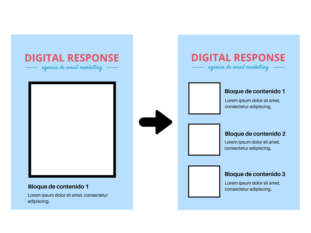
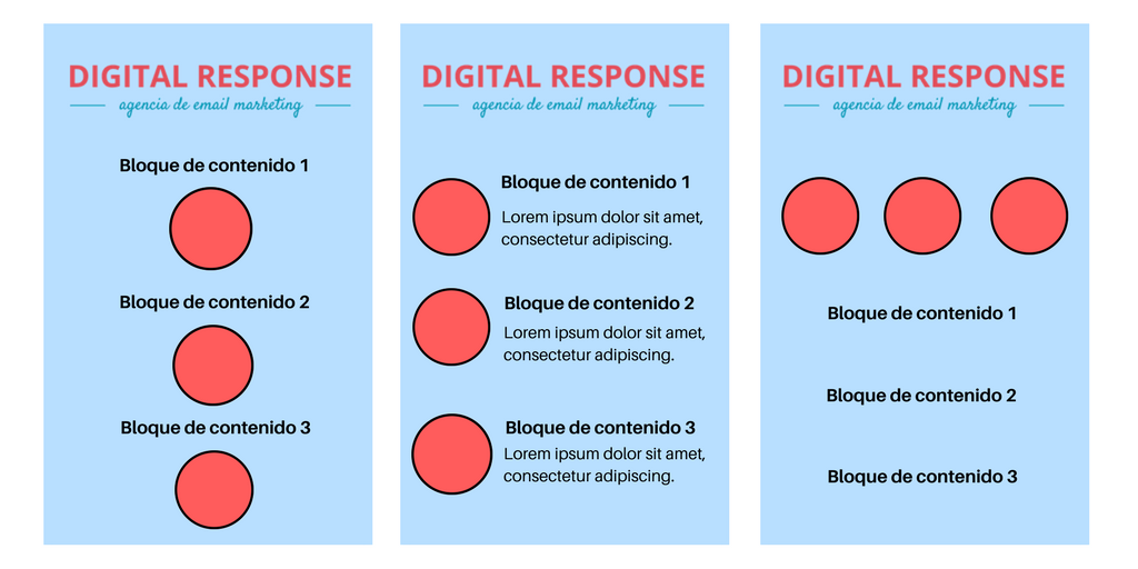
Let's look at an example. We have an email that when viewed on a screen we see, at first glance, 3 different blocks of content side by side. However, when we look at it on the mobile, at first glance we only see one of the three blocks of content. This means that to see the other 2 we have to scroll. What's more, as we scroll through the email, we can see perfectly well that these 3 blocks of content were meant to be together. If we add to that the little time we spend reading any communication that arrives via email, this distribution can become a problem.
What design alternatives can we use to place the content?
- Use the height of the window of a mobile device as a guide to help determine how the content should be positioned and laid out. Here we can see an alternative to a design in which only one block of content was visible. As you can see, now with this change the user can see at first glance all 3 contents displayed.
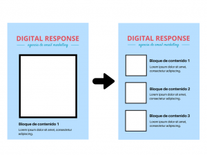 Reduce section header and photo sizeThis way we can fit all the content of that section in a single graphical window.
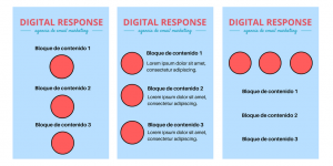
- Explores all the different ways in which content can be positioned. Depending on the context of your design and the nature of the content, other designs may work better. Here are some examples.