Is the use of pop-ups in email solicitation a valid technique?
It is increasingly common to find pop-up based email solicitation systems. This is a tactic that, despite what it may seem, does not penalise the visit/registration ratio and does not increase the bounce rate of the page.. Intuitively we would all agree that a pop-up annoys the user, causing a higher bounce rate than if there were no pop-up. This intuition is what we would use as a basis for recommending less annoying email capture systems. However, there are reasons and data that show that this intuition does not match reality. As for the reasons, they revolve around the idea that a user interested in the content of our sit, will not abandon it by the mere fact that a pop-up appears. If the user's interests are aligned with the content we offer, a pop-up offering the possibility to subscribe to receive information by email should not be an obstacle.. This video makes such arguments very eloquently and clearly.
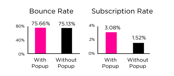
Another type of argument is based on data. In a post entitled "My data shows Email popups work and don't hurt", Dan Zrrella presented the results of analysing the bounce rates and the visit/registration ratio on their page with and without pop-up. These are the results:
As we can see, the bounce rate of the page hardly changed with the use of the registration popup, while the subscription rate doubled.
In order to find the right balance between marketing objectives and the best user experience, we recommend following these basic tips.
- Offer something in exchange for registration. The user, if they are really interested in what you offer, will appreciate that in exchange for leaving their details you compensate them with content of interest to them.
- Modulates the exposure time. Given the intrusive nature of the pop-up, it is important to manage the user's exposure to it correctly. So, for example, you can program it so that with a simple click or scroll the pop-up disappears, or make it so that it is only shown once a week to each user who visits the site and has not registered. In short, think about how to make the user experience suffer as little as possible.
- Show the benefits of subscription. In spite of the limited space, it is worth making an effort to summarise and explain the fundamental benefits that the subscription will bring.
- Test. You should test key aspects such as the location of the pop-up, the benefit copy, the CTA and the duration of the pop-up.