UX (User Experience) in Email Marketing
Before defining the user experience we want to achieve with our email, we must have well defined the objectives of the email campaign: Do we want to increase sales? Get traffic? Make the user register? Introduce a product? Our UX design for email is based on this starting point. We recommend simplifying the choice of targets for our email. It is a channel in which if we do not capture the user in a few seconds, we have lost them. Therefore, having scattered objectives, or expecting several actions from the user can reduce the effectiveness of the message. The ideal is to look for a single action on the part of the user and focus all our design efforts on it. Even so, it is common, and also advisable in many cases, to add other paths to the email in case the user does not perform the desired action, for example, links to social networks, to sections of the brand's website, etc. So what do we mean? What is really important is that the main action is clearly defined. So we are talking about HIERARCHY.
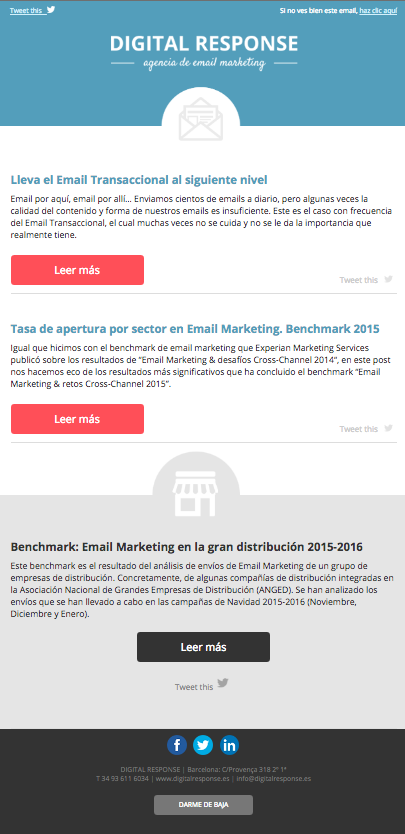
In the case of newsletters (newsletters), this hierarchy is less obvious, as we tend to find a multitude of links to different news items. The hierarchy is usually found in the order of the news items, the space they occupy and how their CTAs stand out. In the case of the newsletter, it is common to find CTAs that are similar to each other, as it is common to link to different contents that are sent periodically in aggregate. This is the case, for example, with our own newsletter:
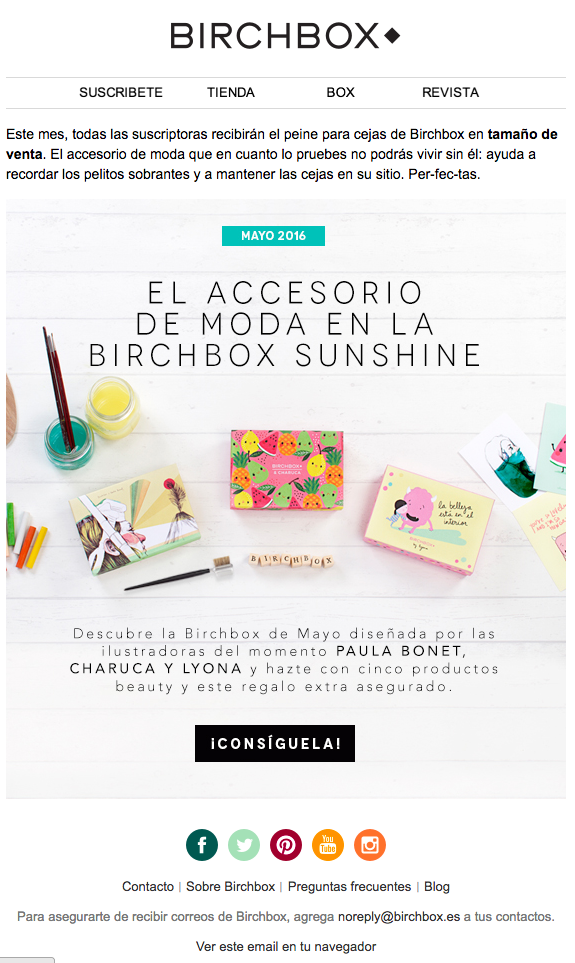
In other cases, we can identify a main objective and guide the user's action to a single path, and in the case of enabling secondary paths, use a visual hierarchy that allows us to reach these options only after having discarded the main path. This is what happens in many commercial emails that directly seek to increase sales. The main offer is highlighted by preferential placement at the top of the email, occupying more space and with a CTA that stands out from the rest of the content. This is what we can see in this email from Birchbox:
The visual hierarchy is one way of directing the user through the content of our email, but there are other elements that can help us. The use of contrasting colours, densities and even visual elements that indicate direction. can help guide the reader's gaze and interaction. For example, the use of 'ghost buttons' is less appealing than a button that is filled in and contrasted with the background.
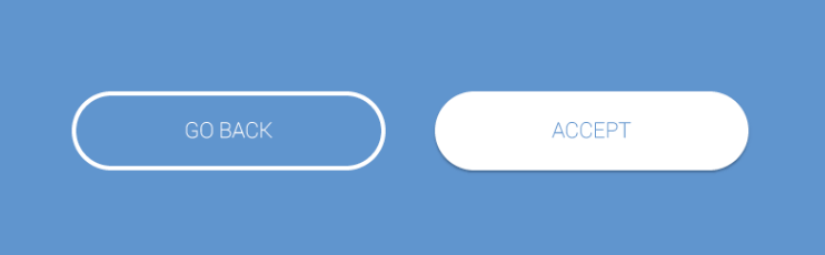
In the last few months, the trend in web design has been the use of ghost buttons and in fact is often used to locate a secondary path in contrast to the sender's desired option.
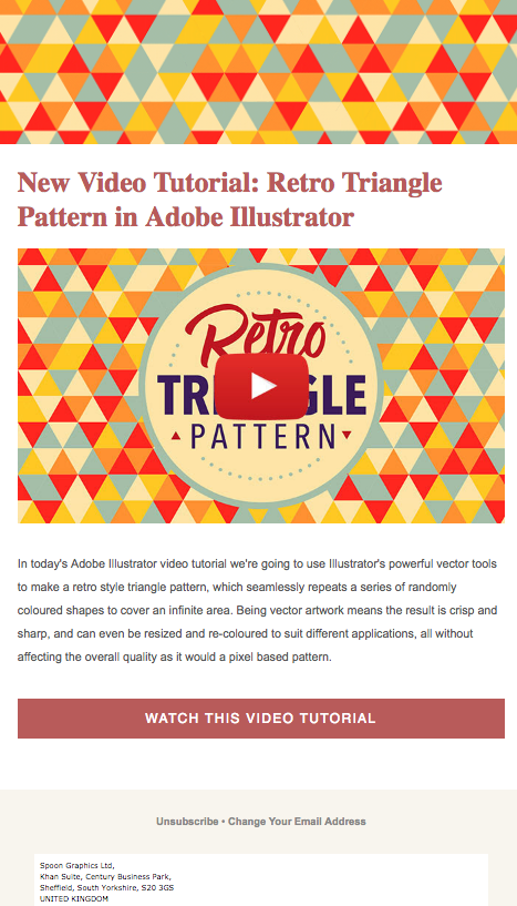
Also, sometimes, if our objective is very clear and we launch a concrete action to achieve it, we can choose to eliminate any alternative routes. And even adapting the email design to the visual elements related to the specific action to increase consistency and fix the idea in the mind of the receiver. This is what we see in this case of Spoongraphics, in which they invite us to watch their tutorial and do without other links to their website, social networks, etc. Leaving only the mandatory links for unsubscribing.
But it is not just about design when it comes to user experience (we should not confuse UX and UI or interface design). The user experience includes the design because through it we guide their interaction and pave the way, but the experience can be negative even if the visual design is impeccable. User experience also refers to what happens before and after opening the email. And here are some key elements:
- SubjectDon't promise something you won't deliver. We often make the mistake of using a subject line that generates openings by appealing to the user's impulse or curiosity. But be careful! If the subject line generates a misleading idea of what is inside the email, we will disappoint the user and generate a negative impression. We need a subject line that can be creative, but it must also be truthful and consistent with the content we are sending.
- UsabilityThe email should be readable, the links easily clickable, do not introduce scrolls without end or absence of white space for the email to breathe. Likewise, the email must be responsive and adapt to the different devices from which users read it. This is a point in which most companies are still failing. And this brings us to the next point:
- Adaptability (not only in email): we said that email should be responsive, but NOT ONLY EMAIL. Too often we find companies that have heard that the mobile opening rate exceeds the 50% of emails and they rush headlong into sending responsive emails... but they forget about the landing pages. A user who displays the email correctly and clicks on an e-commerce site that is not optimised for mobile will have a negative experience and will most likely not complete the purchase process. (This is also true if we are talking about capturing registrations, or other objectives).
In short, for the user to obtain a satisfactory experience through our emails, we must be truthful, guide the user through our interface thanks to a design based on our objectives, facilitate their interaction from any device and optimise their experience even once they have left the email.