How to adapt email marketing to a mobile audience: scalable, fluid and responsive design
Considering that the latest data on mobile email campaign open rates hover around 40% (according to Litmus) we should be aware of this trend and start to understand how we can react to improve the user experience.
As we said in a previous article, the first thing to do is always to analyse our specific situation, but if we detect the need, these are the strategies we can follow to adapt to the new situation:
Scalable (mobile aware)
Mobile aware means that it takes into account the existence of mobile devices and the design reacts by scaling to the available space. Many mobile email applications do this automatically.
Fluid
The email width reacts to device from which it opens, adjusting to the available space in a fluid way. The key is to define the widths in percentages rather than in fixed sizes. It works with simple, usually one-column structures where the text takes precedence over the image, but it is not a good option for more complex designs.
It does not require a lot of work in the code but has the disadvantage that it limits the design to simple structures.
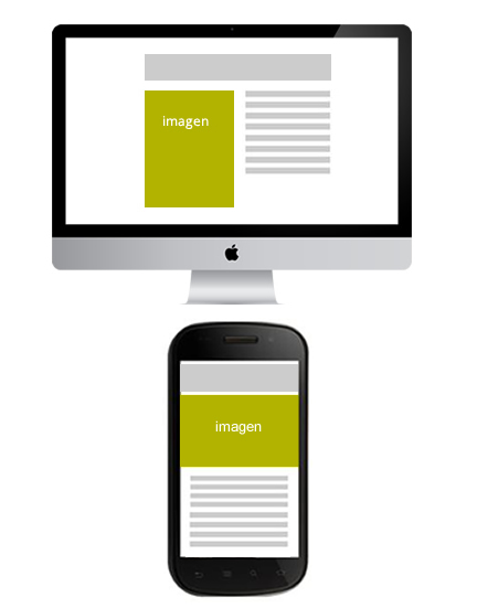
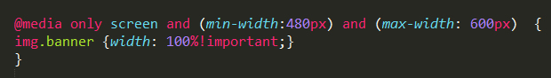
Responsive
Via media queries in the CSS stylesheet we give rules to the device so that it will be display differently depending on your screen width. It requires a bit more complex code and an understanding of how media queries work, but it gives us the possibility to adjust the design and structure (not just the width as in the case of fluid layout) according to the width of the device on which it is displayed.

The latter seems, according to initial experiences and case studies, to be the most effective technique and the one that is achieving the best results. But it is also the one that requires the greatest learning effort. As it uses a young technology such as CSS3, it does not yet have universal standards or general methods that work. We could say that, although it is starting to give very good results, we are in an experimental phase from which we will be able to draw conclusions in time. The decision on which technique to use is determined by the resources and time we have available, but if we have enough time and resources we would choose Responsive Design without hesitation. We will go deeper into this technique later on.