Resources to apply Responsive Design to our emails
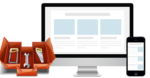
In the previous post we talked about how the Responsive Email Design has been gaining momentum during 2014 and is set to become an essential technique in 2015. To help you get started on this path, here are some resources that can help you:
We can say that the hardest work begins after passing our initial layout through this tool. In it we can see if our email is broken in some clients and look for the solution.
This is one of the best developer articles we've come across. In it, Nicol Merlin guides us step by step to build a responsive template that works correctly in all email clients. As she says, we are not just talking about media queries, but about the combination of several techniques to get an email that adapts to different resolutions:
It makes use of 'minimal media queries' and a 'fluid width' approach to ensure maximum compatibility.
It is an interesting starting point to create your own responsive template, although we do not recommend using them unmodified. The first thing to bear in mind is that the CSS of the templates must be included inline (you can do it with the Zurb tool). But there are also elements in the templates that can be improved. By their own admission, they do not display correctly in Outlook 2007, 2010 and 2013, but there is a solution.
Still, it can save us time to use them as a framework and add our own improvements and modifications as we need them.
- Series of articles about Responsive Email Design in our blog:
- Communities of professionals:
Often, it is not easy to find the answer to a specific problem on the web (although there is more and more information). Therefore, the best option is often to ask. To do so, there are different groups of professionals on the web with whom you can share experiences and get answers to problems that they have also experienced.
Do you know of any other interesting resources for the development of responsive emails? Which ones would you recommend?