Responsive Email Design: Responsive Email Design and Layout Example
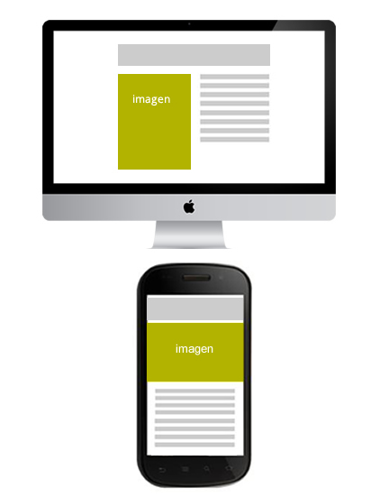
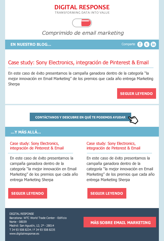
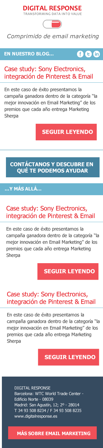
Let's look at a case study to get a better understanding of how the media queries. In the design we saw before our newsletter, this would be the desktop version:
And this is the mobile version:
To layout this responsive emaile would play with percentages and average queries.
We would apply a percentage of 100% to the main table to make it adapt to any device and we would specify some details in the media queries. For example: we would enlarge the buttons in the mobile version to allow the user to click easily.
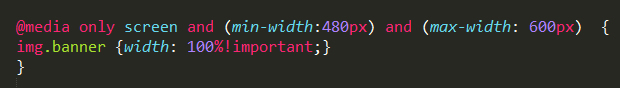
This would be the CSS which would correspond to the first part of the newsletter, where we declare the generic CSS rules and the specific ones for the mobile version so that the text adapts to the width and the button is bigger (be careful, Yahoo shows by default the mobile version of the Responsive layout unless we declare the classes with the attribute instead of with the usual CSS syntax):
<html xmlns="»http://www.w3.org/1999/xhtml»">
<head>
<meta http-equiv=»Content-Type» content=»text/html; charset=utf-8″ />
<style>
table[class=container] {width:600px}
table.share {width:100%;height:35px;font-family:Tahoma, Geneva, sans-serif;colour:white}
td[class=]{width:30%}
td[class=inourblog] {width:50%;text-align-right;font-weight:bold}
td[class=iconos] {width:20%}
div[class=text1] {margin-left:15px;margin-right:30px;font-family: Tahoma, Geneva, sans-serif;font-size:14px;}
div[class=btn]{color:white; font-family:Tahoma, Geneva, sans-serif;font-size:17px;background-color:#F15058;width:30%;padding:10px;margin-right:20px;text-align:centre;margin-top:10px;font-weight:bold}
@media only screen and (max-width: 480px) {
table[class=container] {width:100%}
div[class=btn]{width:75%;padding:20px;margin-right:20px;text-align:centre;margin-top:10px;}
td[class=inourblog] {font-size:14px;width:50%}
td[class=share] {display:none}
td[class=iconos] {width:50%}
}
Responsive Layout
To create responsive structures that change according to the width of the device, the key is to nesting tables. For example, if we have a 2-column structure in an email with a width of 600px that must be adapted in the mobile version to a single column, we will use 2 tables of 300px.) In the desktop version they will be displayed next to each other, but if the available size is smaller, the second table will be placed below the first one, remaining in a single column.
In any case, we remember, as always, that the first step is to analyse the devices on which your audience is opening your email, as compatibility is still a conflicting aspect. Nowadays, a responsive email will only be profitable if our audience shows high open rates on Android and iOS devices, but not if they use the Gmail application, for example, because as we pointed out on other occasions, Gmail ignores the tag. If you want to know more about Responsive Design compatibility in Email we recommend you this article.