Tips for creating a Landing Page
When promoting a product or service, or as a means to obtain registrations with a specific interest, it is very effective to have a landing page or landing page, in which distractions are eliminated, the user's behaviour is directed and the desired information is conveyed clearly and concisely. Here are the keys to take into account so that our landing page fulfils its objective and also helps the user to fulfil theirs.
1. USP: Unique Selling Proposition
USP refers to the differentiating idea of a brand, product or service. It is important to understand that the raison d'être of landing pages is to concentrate our efforts on a clear objective. Therefore, this is not the time to overwhelm the user with various information or long descriptive texts. We must be clear about the USP of the brand or product and make the effort to synthesise it through the interface, images and texts.
2. Form/ CTA
In most cases, our landing page will have a form to collect user data, or at least a CTA that should attract attention. It is important that the form or CTA is placed "above the fold", i.e. before the user scrolls. Or we know how to direct the user to it, guiding them efficiently through the interface. We must use copies that promote trust (the user is trusting that we will treat their personal data correctly) and indicate possible errors in the form with friendly texts that correctly point out where the error is located. Make it clear what the button is and its clickability (e.g. with hover effects) and make the form stand out from the content and not get lost by using similar colours, low contrast, etc.
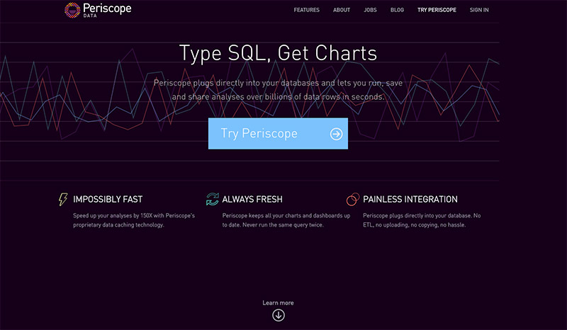
Let's look at this Periscope page. This is not an ad hoc landing page, but the main page of the app, but it uses key aspects we have mentioned so far:
This is a very good example of how to use a straightforward headline, with a subtitle that adds the necessary information and a clearly highlighted CTA. At the bottom, qualities are added that make it clear to the user what benefits they will get from the application. In addition, it takes away distractions by not displaying more information unless the user wants to "learn more" through the link below.
3. Body text
We must try to be brief, but as we saw in the example of Periscope, make it clear to users what benefits they get from our proposal. It is vital to understand that we have little time to capture and maintain the user's attention and therefore, it is advisable to go for direct texts without too many embellishments (unless we use creativity very well to maintain this attention and we can allow ourselves the licence to digress ;)).
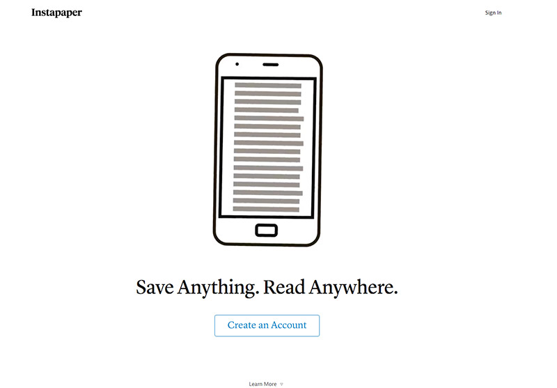
Here you can see an example similar to the previous one. You can see that the tendency is almost always towards minimalism:
4. Images and video.
Images can make a difference in conversion. Especially if we are talking about physical products. The user wants to see in detail what they are going to buy, and therefore, in these cases we must make it as palpable as possible, to overcome the natural handicap of online shopping.
Some tests also show that large images improve conversion. However, this is a statement that we recommend testing on a case-by-case basis. Studies have also been carried out on the impact of video on conversion, usually with positive results, given that video is a way of connecting with the user that requires very little effort on their part. We are increasingly accustomed to consuming video online and we like audiovisual information, and we like it short. In the case of using video, it is advisable to test factors such as autoplay VS press play, CTA in the video, volume on/off...
5. Eliminate navigation: No menu and no hierarchy of links.
Some home pages include many of the keys we have discussed so far, but when it comes to landing pages designed to launch products, services, capture leads... it is advisable to take advantage of the ad hoc design to eliminate any possible distraction. For this reason, it is often advisable to opt for the minimalismAs we saw above, dispense with menus and sidebars with extra information, focus on what concerns us and thus focus the user's attention and action.
If it is necessary to include related links or links that enable navigation to other websites or areas, we can play with the visual hierarchy to direct the user's interaction to the main areas of interest.
6. The second chance
We have stressed the importance of highlighting the form or CTA, but what if the user still overlooks it? Let's give it a second chance. We may think that this simply consists of repeating the CTA below, which happens on many landing pages and is a good practice, but... let's also think about that user who is not yet ready to convert (buy, register...) but who has scrolled and is interested in the subject. What if we try to connect with him to continue nurturing him? We can say something like "leave us your email and we will keep you informed", or simply offer to connect on social networks. This will allow us to impact him again later and mature the lead. DON'T LOSE THE OPPORTUNITY TO CONNECT!
Finally, a word of advice on design trends of the last few years. Until recently we were used to seeing landing pages with a headline and description on the left and a form on the right. It is interesting to see how this usual two-column structure has been changing and we are increasingly used to seeing texts, forms and CTAs centred on the screen, most likely due to the influence of mobile devices. We make this point so that you keep in mind that the conventions that we usually apply and to which the user is accustomed to are very important for usability and these have been changing for some years now. And as always, we would like to remind you that to improve conversion, the most effective way is to conduct tests The best reference data will always be obtained from the concrete reality of each case, even though the experience of others may be of great value.