Responsive Email Design: do you really need it (Infographic)?
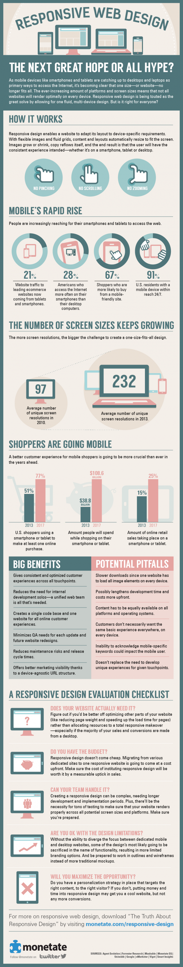
One of the most obvious trends in the web design sector in the last 2 years has been responsive design, better known by the anglicism Responsive Web Design. This trend responds to the rapid integration of smartphones in the lives of users and the ever-increasing data on their use. Websites have been forced to respond with mobile versions, applications, fluid designs... Of these new mobile strategies, Responsive Web Design stands out for its efficiency: a single design adapts to the device from which it is viewed.
This trend has soon reached the email marketing sector. The increasingly high mobile opening data (42%) make it impossible to ignore the need for new strategies to improve the experience of these users. The Responsive Email Design is beginning to emerge as one of the best ways to face the new scenario. Even so, we must not lose perspective and think that adaptive design is a universal solution. We must always consider the data available to us in our specific situation, so that our adaptation efforts are not in vain.
We leave you with a infographics that have been prepared by Monetate on Responsive Design, which although oriented towards web design is perfectly extrapolable to the email and landing page design. In it, they ask whether responsive design is the ideal way forward for the new mobile reality or just a hype (more hype than anything else) and give some ideas on how to decide whether we need it or not.