CLIENT: TOUS AGENCY: Digital Response CASE: Applying Responsive Email Design to Email Marketing Strategy
CLIENT: TOUS AGENCY: Digital Response CASE: Applying Responsive Email Design to Email Marketing Strategy
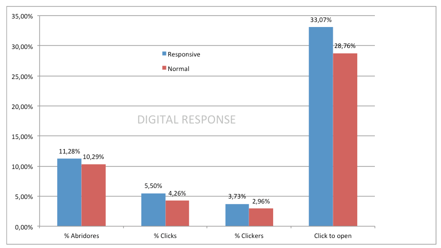
We have recently carried out an AB test for one of our clients to determine the impact of responsive email on user behaviour. CONTEXT
We've been talking a lot lately about responsive email design on our blog, and in the developer forums and discussion communities it's also one of the hottest topics (it may sound strange that this boom is happening years after its web equivalent, but we've already talked about the limitations imposed by the channel and the [...]
Recently we read on the Action Rocket blog a post about A/B testing of responsive emails. The headline was "Split testing responsive email design: You're doing it wrong" and it said that testing a responsive email VS a non-responsive one doesn't make much sense.
In this post we want to share with you four tips that we have collected from the eBook published by Movable Ink entitled "Tips and Tricks for Email Marketing Success in the Mobile Inbox" on how to adapt Email Marketing to the mobile context. Those of you who want to access the original document can do so by clicking on this link.
Mobile is changing the way users engage with our emails. The figure that we usually keep is that half of our recipients are already opening email on their mobile phones. But we must not forget that there are other circumstances that are changing and must be taken into account in order to [...]
Via Geek.com, we've come across some screenshots of the new changes Gmail is planning to implement in the near future. Recently, we heard about tests being carried out on a much more visual Pinterest-style promotions tab:
These days we have been talking a lot both on the blog and in other online communities about the challenges of creating responsive emails, especially in the layout phase. This is due to the incompatibilities that currently exist between the diversity of devices and email clients.
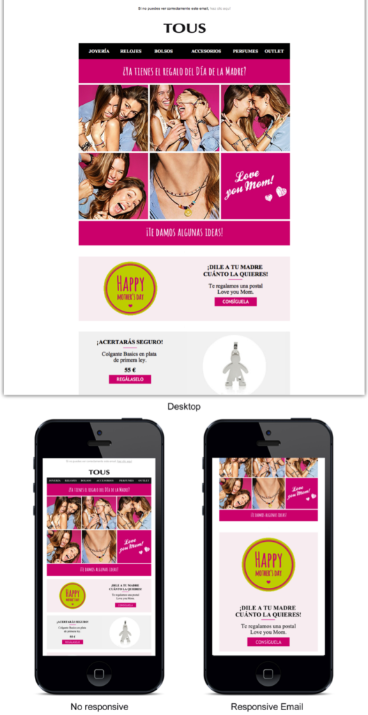
Let's see a practical case to finish understanding how media queries work. In the design we saw before for our newsletter, this would be the desktop version: And this would be the mobile version:
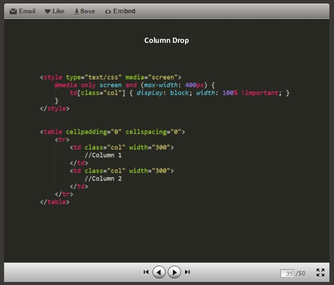
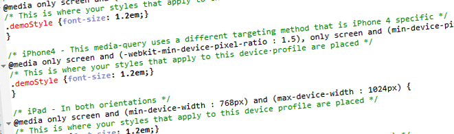
In another article we advanced how the CSS rules that enable the adaptation of our design work. We are talking about media queries, an element that comes from the hand of CSS3 and whose operation we can understand very well on the web http://mediaqueri.es/ where we can find many examples of how a website can change depending on the [...]