
Responsive Email Design: How to design a mobile-friendly email
To achieve a good responsive design, all we have to do is think about the user experience, put ourselves in the place of the person receiving the Email on a mobile phone or the tablet and see if it is a usable and attractive design. Some of the things we will easily discover in this exercise are the following:
– Structure of a column: It works best on mobile devices, as we have a very small width.
– Buttons and large links: Remember that we’ve gone from designing for a cursor to designing for a finger, and there should be enough space to click with ease.
– Big wellIn most cases we will have to increase the font size and often the interline spacing to ensure proper readability.
– Look Mobile: We must facilitate the user experience by adapting the style of the email to what they are used to seeing on mobile devices. Taking advantage of established conventions for these types of devices can help us. These conventions can include icons, the location of objects…
Here is an example of what our newsletter would look like without applying the responsive design (scaling to the size of the device) and applying it in the second case:
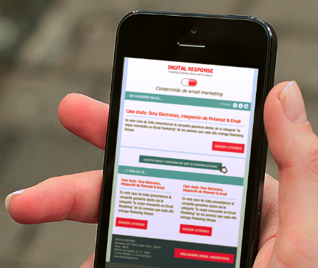
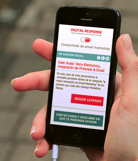
You can see that the second option involves a significant change in readability and usability.

