Responsive Email Design: How to create a responsive email layout
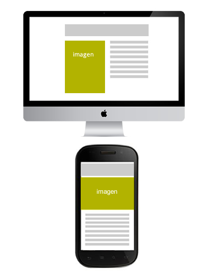
At In another article we explained how the CSS rules that make it possible to adapt our design work.. These are the media queriesan element that comes from the hand of CSS3 and whose functioning we can understand very well in the web site http://mediaqueri.es/ where there are many examples of how a website can change depending on the width of the device on which it is displayed. While there is a great deal of information on Responsive Web Designsince it has been a trend for a couple of years now, we did not find much information on the web specifically on responsive email design. However, it is easy to extrapolate the way of working on the web to email. The main obstacles we encounter are due to the different email clients that interpret styles differently. So, if in web design, it's a headache to do tests crossbrowser and check that it displays the same in all browsers, email adds the headache of the different platforms. and levels of compatibility.
In any case, given the new and growing data on the mobile opening ratesIn the meantime, it is to be hoped that this lack of adaptation to the latest technologies in email clients will soon be remedied.
Another problem we encounter is that emails are laid out differently from the web: tables, inline styles... And this leads us to ask ourselves... where do we put the media queries? Necessarily we have to break the inline style rule, since it is not possible to embed these rules like this. The solution is to embed the CSS rules in the email header between the tags. In doing this we must understand that Gmail will not take these rules. We might think that it is best to put all the CSS rules of the email inside the code and leave just the media queries inside the tag, but don't forget that CSS rules work in cascade and this means that the last rules declared in the document will override the previous ones. Thus any inline style would overwrite what is declared in the head of the email. Therefore if we want our email to be responsive we can only declare general inline style rules that are not going to be modified according to the width of the device. The styles that can be changed will all go in the head, and the media queries to the queue of rules to be taken as a priority on a device-by-device basis. Some point out that adding !important to the CSS rules in the head would solve the overwriting of inline styles, but in some tests we have done this is not always the case.
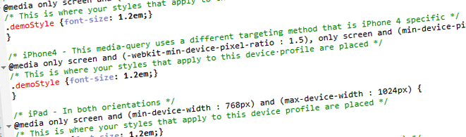
Let us now look at some more technical details of how it would create a media query. As long as you are familiar with style sheets, you will find it easy. It is simply a matter of declaring the specific rules for each size within a declaration of this form:
@media only screen and (max-width: 480px) { ... }
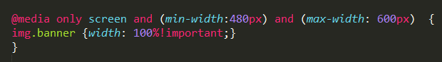
Or we can even specify further by giving it a maximum and minimum width, for example:
@media only screen and (min-width: 480px) and (max-width: 768px) { ... }
Within the brackets we will place the specific rules for each measure. There is no consensus on the points of change of the rules, but a logical definition could be:
Mobiles: Max-width:480px
Tablet: min-witdh:480px and max-width: 800px
Desktop: min-witdh:800px and max-width: 1200px
High-resolution desktop: min-width:1200px
In any case, at the production stage, we may detect the need to declare further media queries to correct some details that don't quite fit in with the most common rules. If you would like to know more about how we work in the agency, please contact us. responsive email templateswe recommend this article.
We would like to know more about your experience with Responsive Email Design, in this case in its more technical aspect. Have you managed to overcome the compatibility problems between devices and applications? Do you know of examples to take as a reference? Should we consider Gmail as lost on this path? In this phase of maturity, debates like this one are necessary to get closer to a technical standard and a standard way of working.
To find out more about responsive email we recommend that you take a look at our Webinar.