Email marketing agency in Barcelona In today's digital environment, connecting with users in a personalised way is key to the success of any strategy. In Barcelona, Digital Response is positioned as an email marketing agency specialising in effective and automated email campaigns. Why work with an expert agency in email marketing?
Responsive Email Design: resources and materials from our webinar
Last Wednesday we launched our first webinar. The theme of this first seminar was Responsive Email Design, a hot topic in the email marketing sector that many of you are still "afraid" of due to the lack of homogeneous interpretation by many email clients.
Yahoo fixes its problems with media queries
At the beginning of February, Fresh Inbox started a campaign to ask Yahoo to fix its incompatibility with the media queries we use to make our emails responsive.
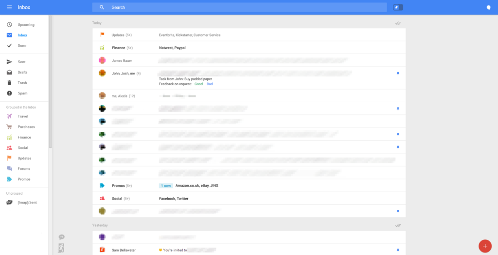
Gmail tests more mobile-friendly interface but still ignores responsive design
Via Geek.com, we've come across some screenshots of the new changes Gmail is planning to implement in the near future. Recently, we heard about tests being carried out on a much more visual Pinterest-style promotions tab:
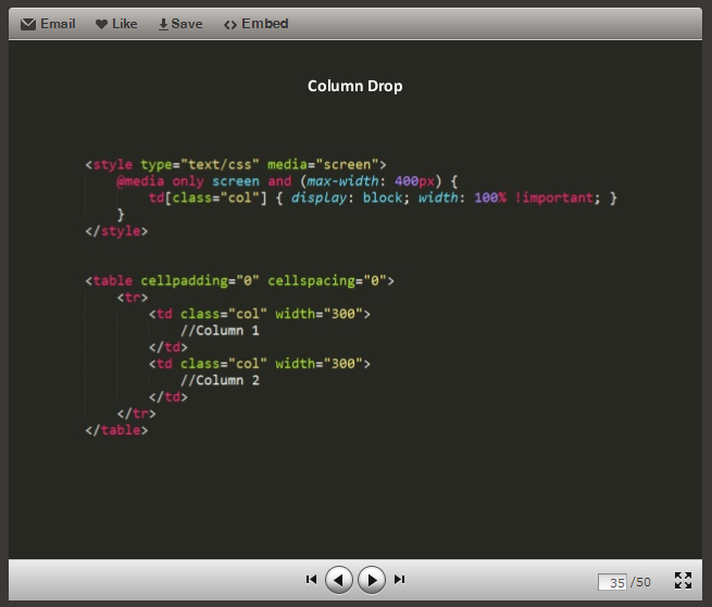
Responsive Email Design: Tips for HTML/CSS Layout
These days we have been talking a lot both on the blog and in other online communities about the challenges of creating responsive emails, especially in the layout phase. This is due to the incompatibilities that currently exist between the diversity of devices and email clients.
Responsive Email Design: Responsive Email Design and Layout Example
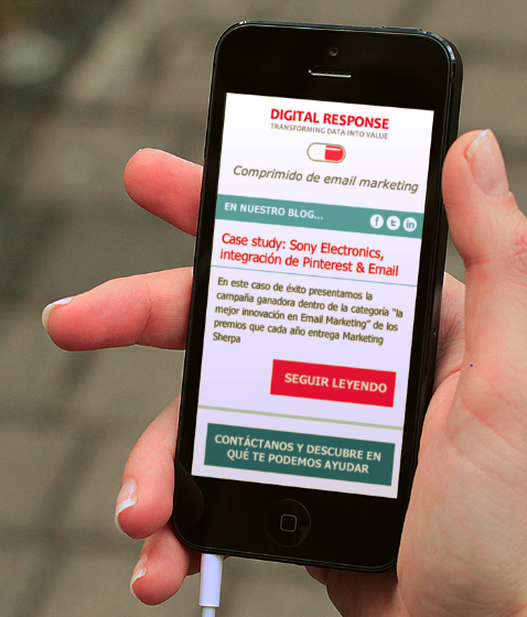
Let's see a practical case to finish understanding how media queries work. In the design we saw before for our newsletter, this would be the desktop version: And this would be the mobile version:
Responsive Email Design: How to create a responsive email layout
In another article we advanced how the CSS rules that enable the adaptation of our design work. We are talking about media queries, an element that comes from the hand of CSS3 and whose operation we can understand very well on the web http://mediaqueri.es/ where we can find many examples of how a website can change depending on the [...]
Responsive Email Design: How to design a mobile-friendly email
To get a good responsive design all we have to do is think about the user experience, put ourselves in the place of the person receiving the email on a mobile or tablet and see if it is a usable and attractive design. Some of the things that we will easily discover in this exercise are the [...]
How to adapt email marketing to a mobile audience: scalable, fluid and responsive design
With the latest mobile email campaign open rates hovering around 40% (according to Litmus), we should be aware of this trend and start to understand how we can react to improve the user experience.


